2022-06-23
At the beginning of the year, Pantone, the color authority, officially announced the 2022 color of the year--PANTONE 17-3938 Very Peri
Very Peri is the first time Pantone has created a new color to define the Color of the Year.
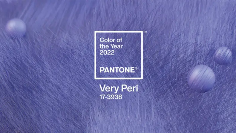
If we express it in terms of color, it should be somewhere between blue and violet. For the reason for the emergence of very peri, the official explanation - "When we are out of a period of intensive isolation, our thinking and standards are changing, and our physical and digital lives are also combined in new ways. Very Peri is exactly what a symbol of the global spirit of the moment. It opens our hearts to new horizons and helps us embrace our changing natural environment as we reshape our lives.”
Very Peri is inspired by the rise of the Metaverse and the prolonged impact of the epidemic. "We live in unprecedented times that require the introduction of an entirely new colour, rather than the extraction of one, Very Peri represents the increasingly blurred boundary between the physical world and the digital landscape."
Very Peri is also widely used in home decoration. It can be gentle and healing, it can be colorful and warm, it can be futuristic, or it can be sweet and lovely.
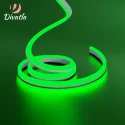
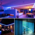
Sense of Future Technology
Just like the Very Peri coming from the sky, it has a color that is infinitely close to the universe, full of vast and mysterious temperament. This kind of temperament is used in home design, reflecting a sense of future technology.
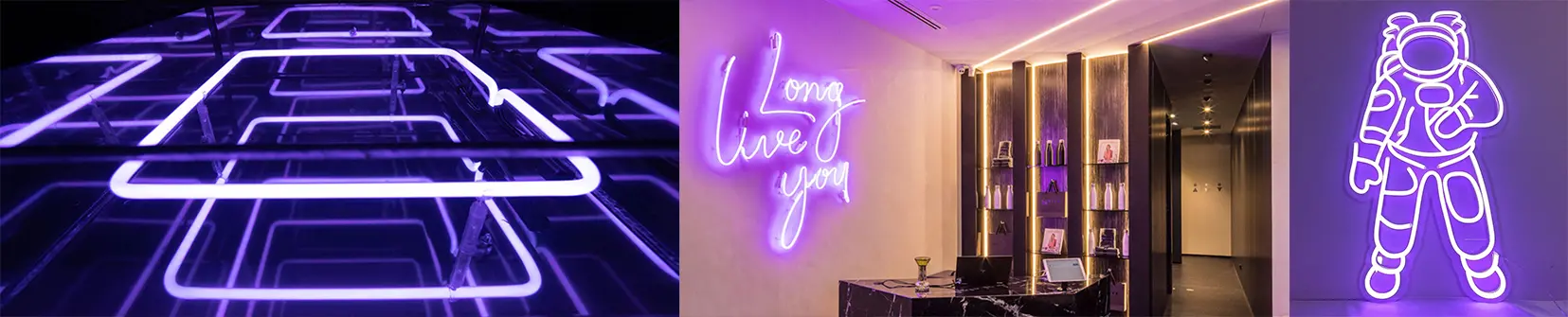
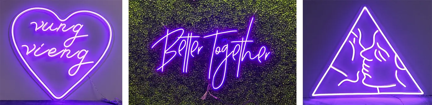
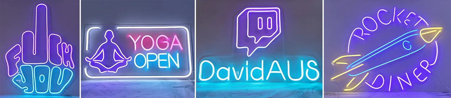
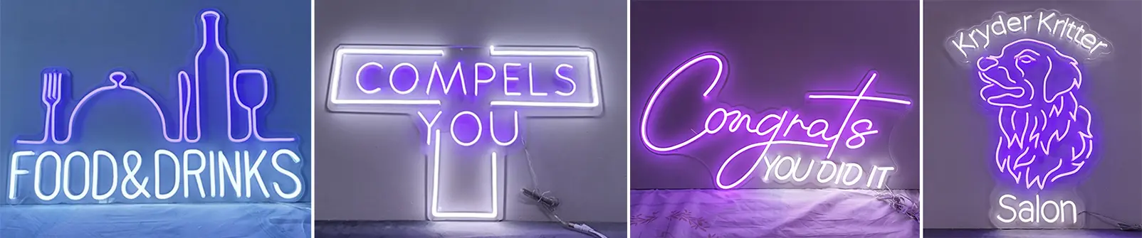
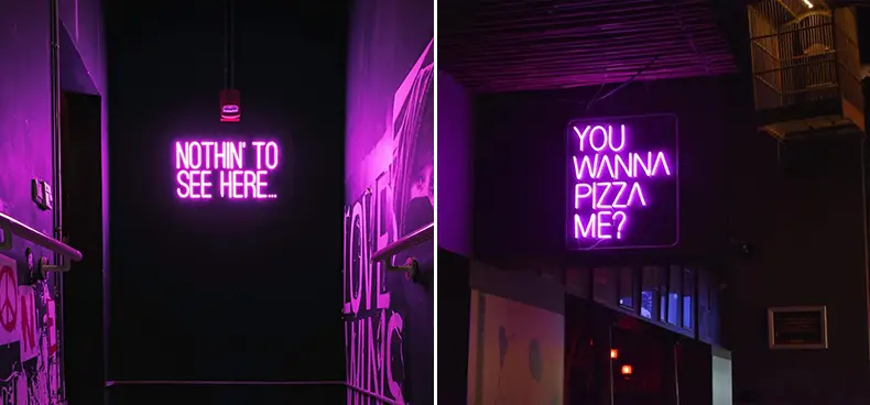
In many exhibition halls, art galleries, cafes... we can see the neon signboards in "Very Peri" color. The large number of blue and purple colors create a vast and fantastic world with the help of different patterns and artistic fonts.
Sense of romantic
The sweet and gentle very peri is the happiest and warmest color when the red, which symbolizes vitality and excitement, is infused with the blue that gives a sense of tranquility, stability, loyalty, and eternity.
Infinite sense of vitality
The collision of blue elements and purple elements shows a smart, cheerful attitude and a dynamic style, which can inspire people to have more courage to be creative and to imagine boldly.
Sense of Freshness
Purple and white are the most beautiful combination. When the gentle and elegant purple and clean and refreshing white collide together, it gives people a fresh and natural feeling.
Free between blue and purple, it has the quietness of blue and the noble mystery of purple. In the post-epidemic era, we must strive to wake up from silence, embrace more changes, and face the future world with a calm attitude.
Spring has arrived, and the colors on the streets have brightened, pink, orange, yellow, red... Among the thousands of flowers, have you ever paid attention to that fresh very peri ?